The Blog
My 3 Step System to Triple Your Content Output
October 5, 2022
Table of Contents
Share on Social Media!
There’s nothing worse than getting home from a photoshoot, feeling like you nailed your content, and then realizing that you have too many similar looking photos.
We all know the Instagram struggle, right? You can post a photo far faster than it takes you to create it. At that rate, you’re on a hamster wheel of creating and posting that feels more like a grind. What’s one way that we can stop this? Not just getting more photos out of each outfit per session, but making sure you get the right photos. How do we do that? By using my three step system that guarantees three different looking photos in the same outfit.
Want more Instagram tips and tricks? Download my free guide that will give you caption prompts, photo ideas, and posing suggestions so your next nine Instagram posts will practically create themselves!
My 3 Step System to Triple Your Content Output – Horizontal
To start, have your photographer (or tripod) take a few steps away from you and turn the camera/phone horizontal. While the natural Instagram crop is a square, don’t doubt how horizontal photos can bring a different feel to your grid. They offer more of the landscape around the subject and can draw the eye to the environment. They also tend to feel expansive in a way that vertical photos don’t.

My biggest tip about horizontal photos is to make sure that you have enough room to crop. Because Instagram does show photos as a square, if you don’t have enough space around the subject, you’ll lose some of it when you go to post. There isn’t a hard and fast rule, but I usually take one additional step back from wherever I would naturally stand to take the photo.
You can also choose to shoot full body horizontal, instead of shooting from the waist up, like I did with the above photo of Olivia. As long as the camera is horizontal, you’re good to go.
My 3 Step System to Triple Your Content Output – Portrait
Compare the photo of Olivia below (on the left) to the photo above. They were taken moments apart, but you can see the difference between when you shoot horizontal versus vertical. You get more of the surrounding context with the horizontal shot, although you still get some of that with the portrait. Had I taken the photo even tighter (maybe from the chest up, instead of from the mid-thigh up), you’d lose more of the background. There isn’t a right or wrong answer, just things to keep in mind.


Another way to distinguish your portrait photo from your horizontal photo is to have one with the subject looking at the camera and one with them looking away. The photo of Olivia above on the right is only a few steps away from the photo on the left, but part of what makes it different (aside from the fact that she is sitting down) is that she is looking at the camera! Varying photos in this way on your Instagram also helps to give it a more diverse feel.
My 3 Step System to Triple Your Content Output – Detail
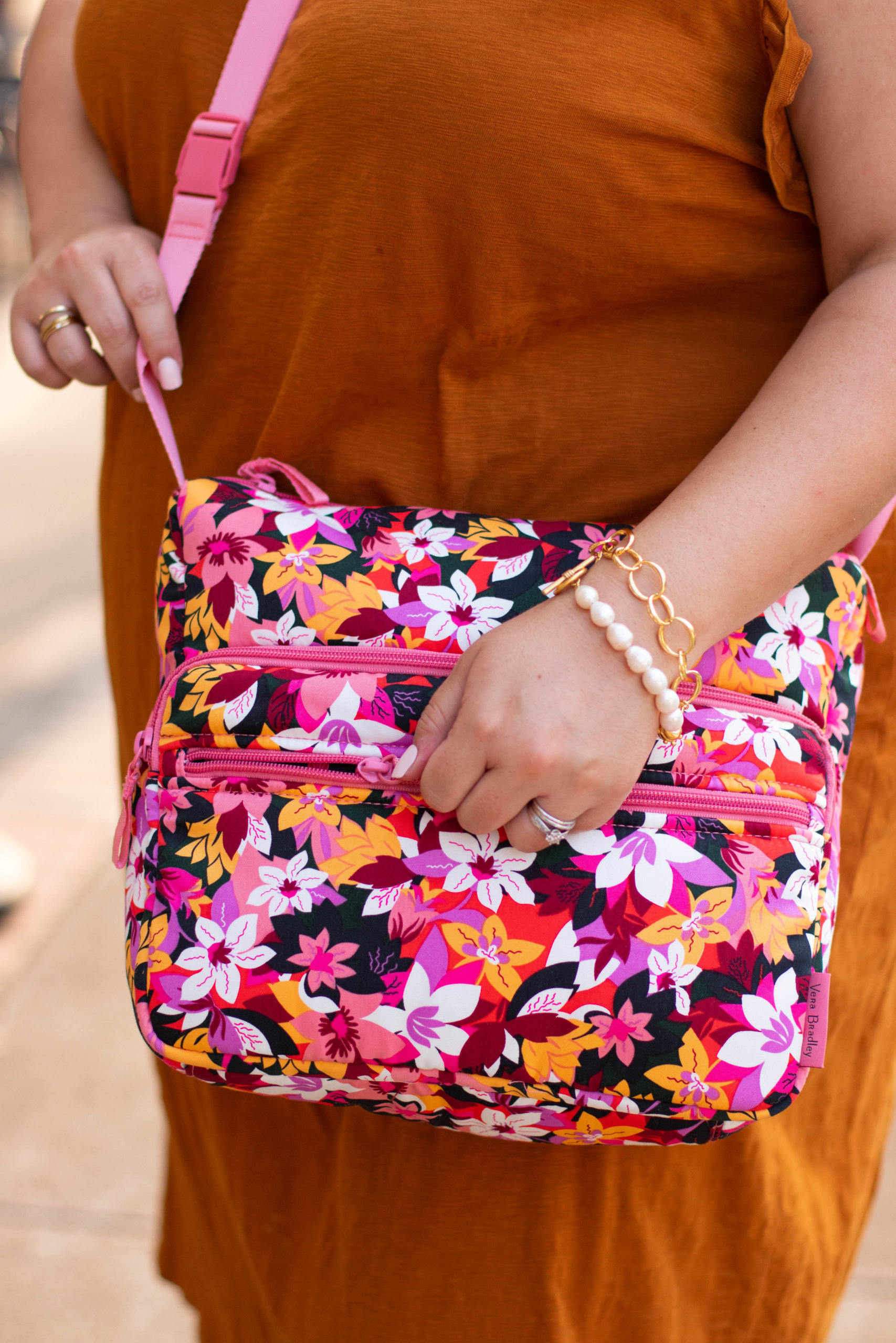
The shot that I am the worst at remembering to get is the detail shot. Aside from being a great way to potentially partner with brands, showing off detail shots helps your audience get to know you through the things that you love. In the photo of Olivia below, you still get a good idea of her personality, even though her face isn’t in it. From her accessories, we get a fun and girly vibe – which is absolutely Olivia’s personality!

My 3 Step System to Triple Your Content Output – Conclusion
When implementing this system, I’m not saying that you should only take these three pictures and move on. It depends on how much time you have and what you are planning on doing with the photos. Sometimes an outfit is more a filler for your content and you don’t think you’re going to feature it repeatedly and on different platforms. If that’s the case, then maybe just the three photos will be sufficient. If it is an outfit/brand/piece that you know you’re going to want to feature a lot, definitely take more photos.
My system isn’t about limiting what you can do. It is a way to make sure that you get three varied and usable photos for every outfit so, when you are planning your Instagram grid, you have plenty to choose from!
